Newsletter redesign
Yanmar
CLIENT - ASSIGNMENT - GOAL
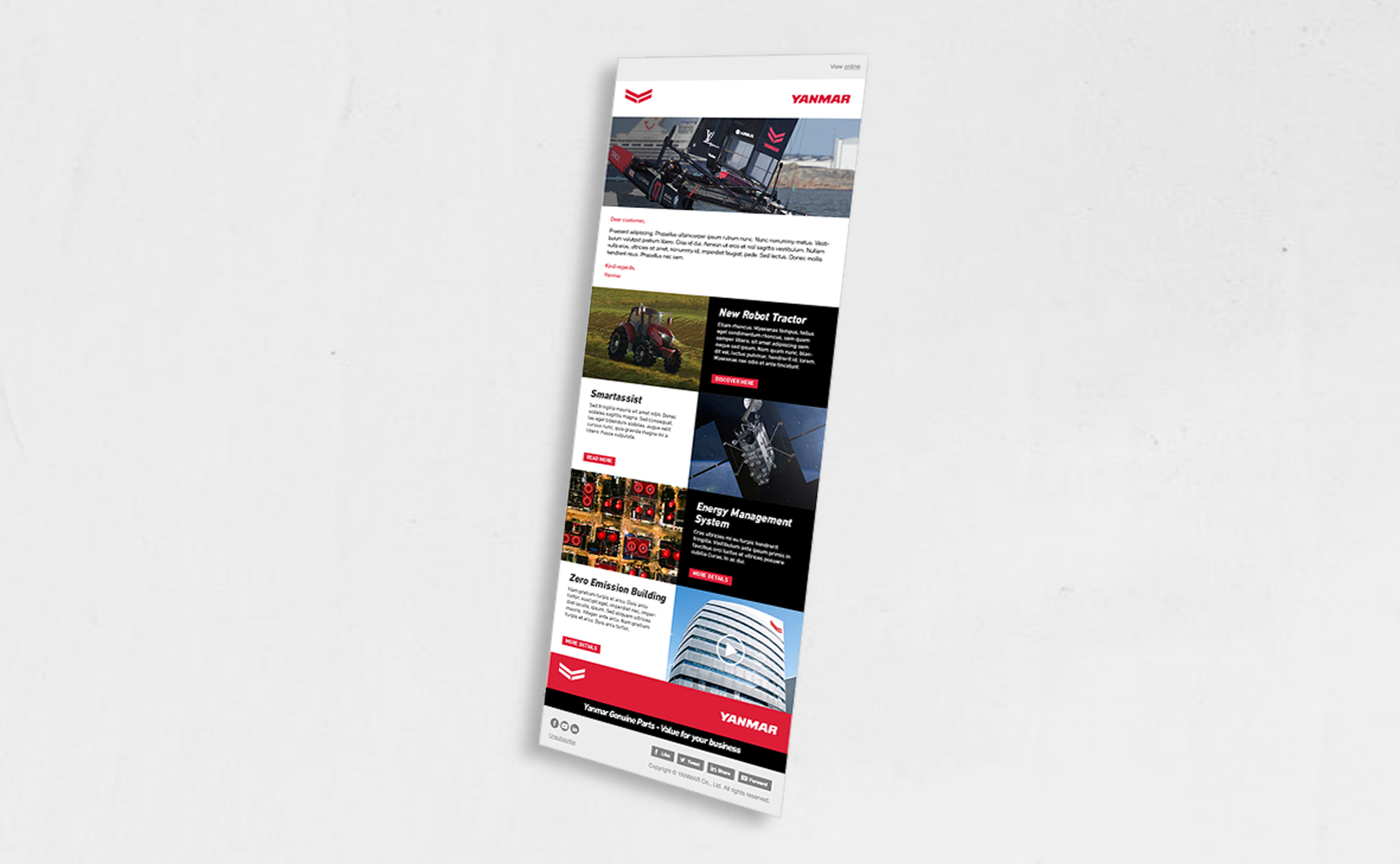
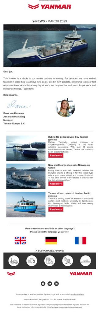
For this case, I worked on an assignment for Yanmar, an international company specializing in industrial engines and machinery. They asked me to redesign their monthly newsletter, which they felt had become outdated and no longer aligned with their current brand identity.
It was important that the newsletter not only received a visual upgrade, but also improved in structure and readability. The client wanted a more professional and modern look without losing the recognizable elements of the Yanmar brand.
The goal was to create a functional and appealing newsletter that clearly communicates information, increases click-through rates, and encourages readers to stay engaged, both on desktop and mobile.
CHALLENGES - MY ROLE - PROCESS
The biggest challenge in this project was finding the right balance between the corporate visual identity and a lively, engaging design. Yanmar’s brand guidelines are quite strict, with set colors and typography. This left little room for experimentation, while the newsletter still needed to stand out in a crowded inbox.
My role was that of a web designer. I started by analyzing previous newsletters: where did users drop off? Which elements were still effective? Based on those insights, I created wireframes and early sketches. I also researched current email design trends and looked at how other technical B2B companies approached their newsletters.
Throughout the process, I worked iteratively with Yanmar’s marketing team. I presented multiple design options, always keeping user behavior in mind (such as mobile use and scan-friendly layouts), and ensured every element remained consistent with their brand identity. This led us step by step to a strong final design.
RESULTS - IMPACT - REFLECTION
The result was a visually appealing newsletter with a clear layout and a modern, fresh look. Thanks to improved hierarchy and a consistent structure, the content became easier to digest without losing Yanmar’s technical and professional tone.
The redesigned newsletter was well received internally. The marketing team noticed an increase in click-through rates and received positive feedback from readers. The newsletter design was later reused as a template for other internal communications, extending the impact of the redesign.
What I learned from this project is how to find opportunities for innovation within strict brand guidelines. I also gained valuable experience in email design, especially in terms of scanability, technical limitations, and mobile-first thinking.