Interactive newsletter
T-Mobile
CLIENT - ASSIGNMENT - GOAL
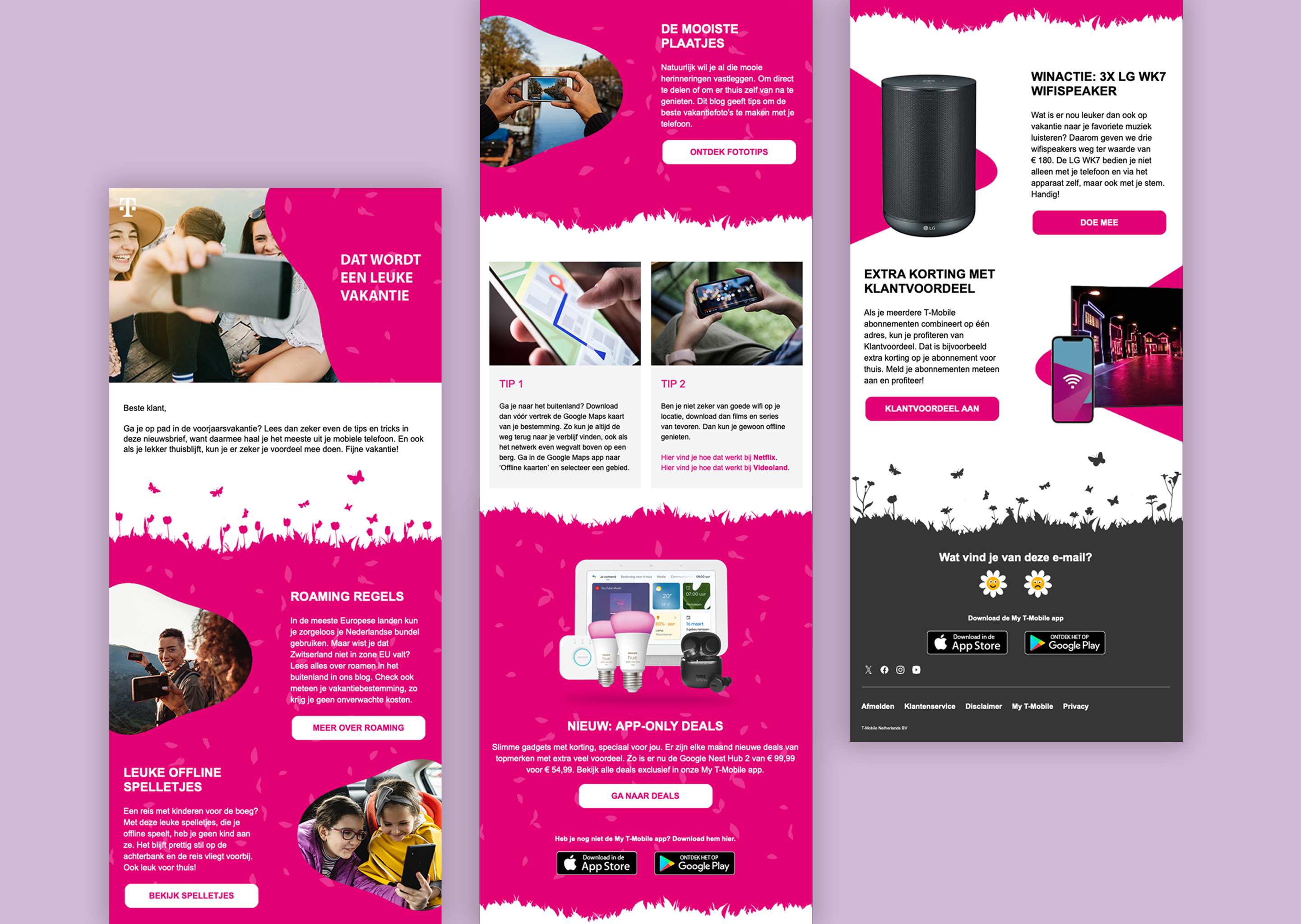
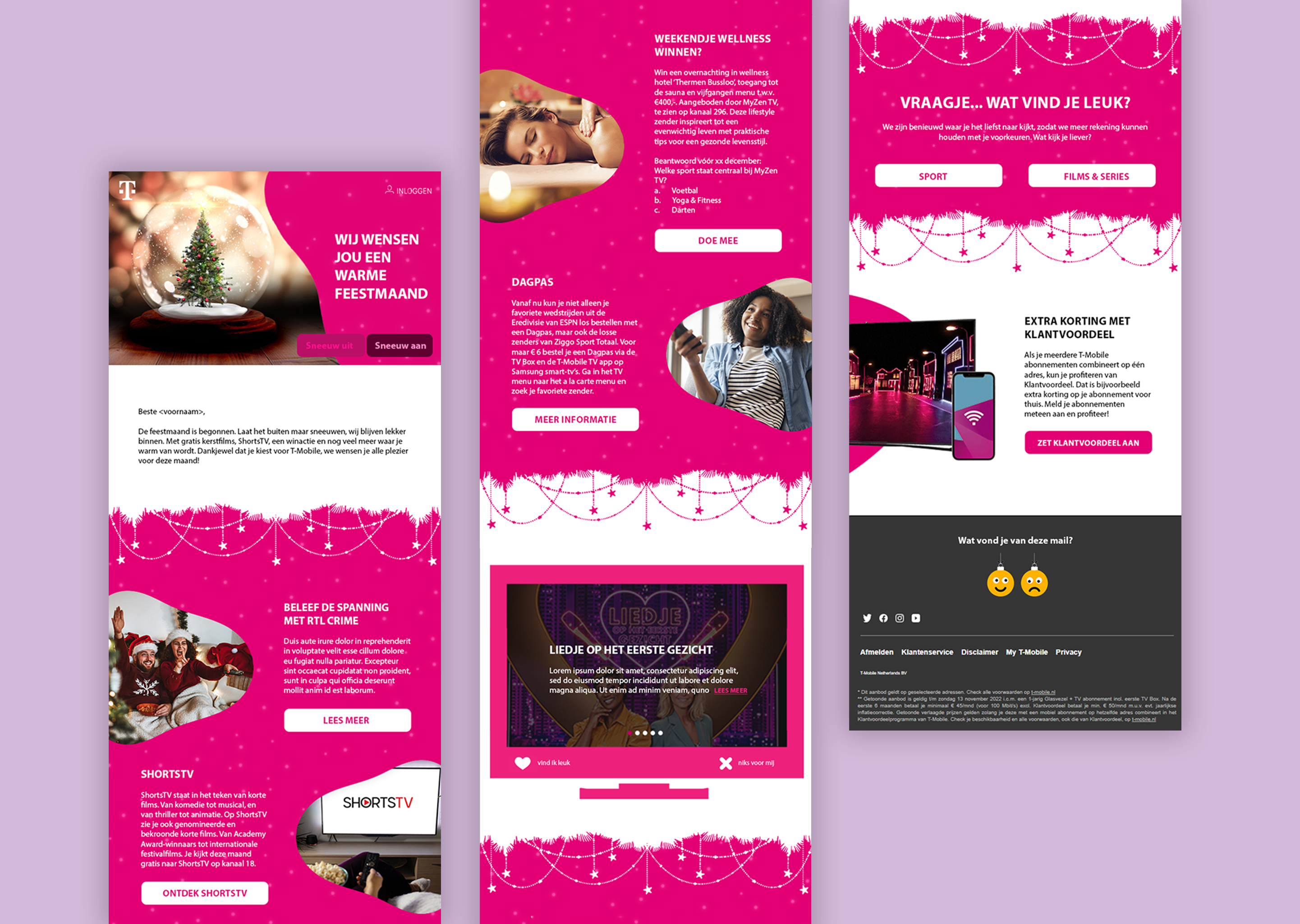
For this case, I collaborated with T-Mobile, a well-known telecom provider. They approached us with a request to give their December newsletter a complete makeover. There was no fixed brief, just the freedom to try something new, something that would surprise and engage their customers.
The task was to design an entirely new layout for the newsletter, tailored to the festive December period. Beyond a fresh new look, the goal was to make the newsletter more appealing and innovative, ultimately increasing its open rate and the number of clicks.
T-Mobile’s objective was clear: reach more customers through their email communication, boost click-through rates, and test whether a more creative approach would drive higher engagement. The focus was on fresh thinking and leaving room for experimentation.
CHALLENGES - MY ROLE - PROCESS
The biggest challenge in this project was balancing a tight deadline with complete creative freedom. There were no fixed guidelines or content structures, just the desire to do something new. That meant I had to build everything from scratch, creating something that would stand out both visually and technically.
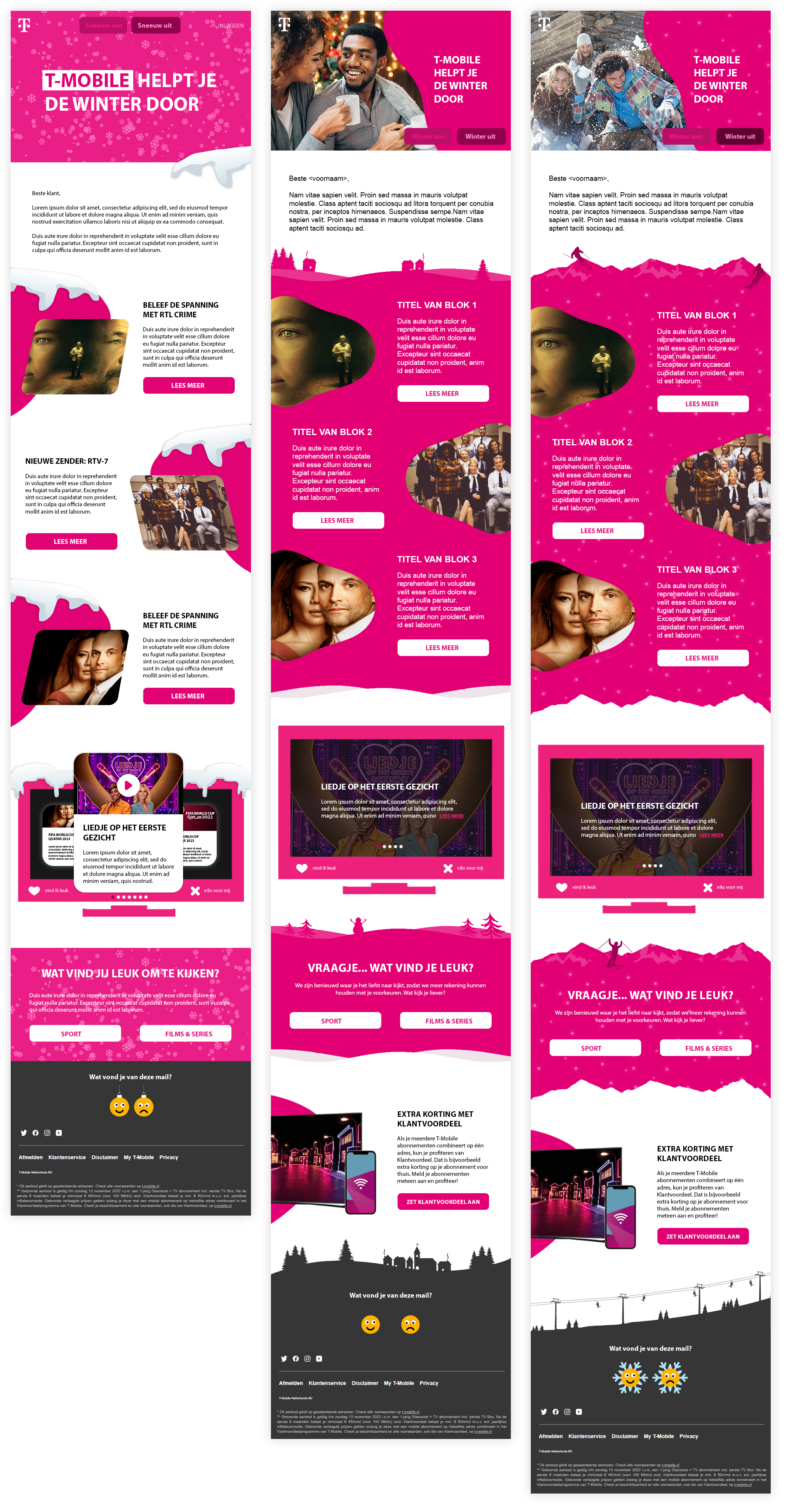
I took on the role of designer from start to finish. I developed the concept, designed the full layout, and explored ways to make the newsletter more interactive on a technical level. I drew inspiration from the winter season, working with themes like snow, cold, and coziness. Based on that, I gathered visual references and began crafting the design.
In addition to the visual elements, I also explored techniques to add motion and interactivity to the newsletter. That’s how I came up with the idea of a slider that could activate animated snowfall something that had never been used in T-Mobile’s emails before and was meant to truly surprise the reader.
RESULTS - IMPACT - REFLECTION
The end result was a cheerful, interactive newsletter with a winter theme. The main eye-catcher: a clickable slider that let users trigger falling snowflakes across the entire email. The design was playful and creative, without compromising on clarity or usability.
The reader's feedback was overwhelmingly positive. Both customers and colleagues noted that this edition really stood out from previous newsletters. The animation was seen as original and surprising, and the number of clicks increased noticeably.
I’m proud of this project because it gave me the opportunity to combine visual creativity with technical innovation in a single design. The result not only enhanced the user experience but also proved that a newsletter can be much more than just a standard email, if you're willing to experiment.