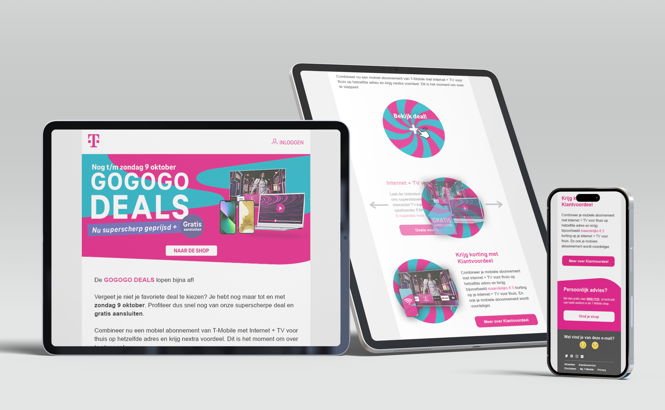
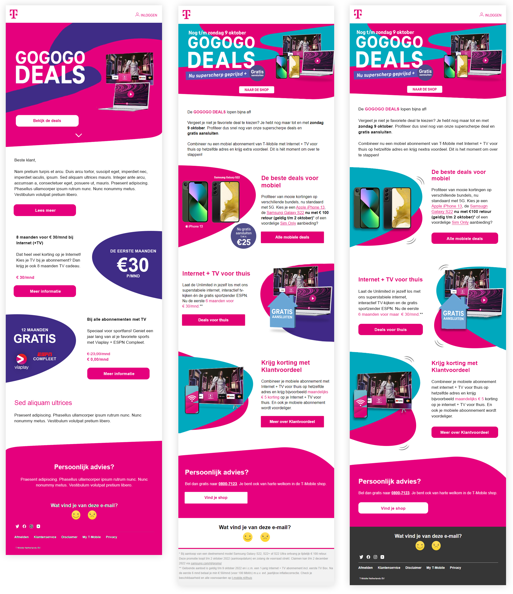
GOGOGO Deals
T-Mobile
CLIENT - ASSIGNMENT - GOAL
For this project, I worked with T-Mobile, this time specifically for the promotional campaign of GOGOGO Deals. The request: design a newsletter that visually and tonally aligns with the refreshed style of these promo weeks, and make sure it stands out from regular campaigns.
The assignment focused on developing a newsletter template that was energetic, eye-catching, and in line with the GOGOGO Deals branding. Think bold colors, dynamic visuals, and clear promotional messaging. The communication needed to be direct and reflect the limited-time nature of the campaign.
T-Mobile’s goal was clear: to amplify the impact of GOGOGO Deals through email marketing, using a newsletter that not only fits within the brand experience but also drives action. A strong visual identity paired with a sharp focus on conversion.
CHALLENGES - MY ROLE - PROCESS
The biggest challenge was transforming a standard newsletter into something original and distinctive. The content needed to be promotional, but without becoming dull or predictable. This required creative thinking within clear visual boundaries.
In my role as visual designer, I chose to focus on motion and interactivity to bring the newsletter to life. I explored various animation techniques and how they could be implemented technically within an email environment, keeping in mind what does and doesn’t work across different email clients.
Using the GOGOGO Deals style as a foundation, I developed a design featuring motion elements, bold colors, and striking shapes that together created a vibrant and energetic whole. The result was a newsletter that invited users to explore and click through, visually engaging and functionally effective.
RESULTS - IMPACT - REFLECTION
The end result was a dynamic, interactive newsletter that perfectly captured the energy of the GOGOGO Deals campaign. With subtle animations and playful elements, the email became visually surprising without compromising readability.
The newsletter was well-received by both the client and end users. Feedback described it as "unique" and "appealing", something that stood out in the inbox and encouraged action. The refreshed approach was noticeably different from previous editions.
I’m proud of this case because it shows how color, form, and motion can transform a static medium into something that truly speaks. It reinforced for me that even small technical additions can make a big difference in both experience and impact.